QUESTION TWO.
I believe that the combination of our music video and ancillary texts is very effective and the connection between them, I believe, is very clear. Here is an embed video of our music video, and my ancillary texts. The password is student.
Please watch the whole video :)

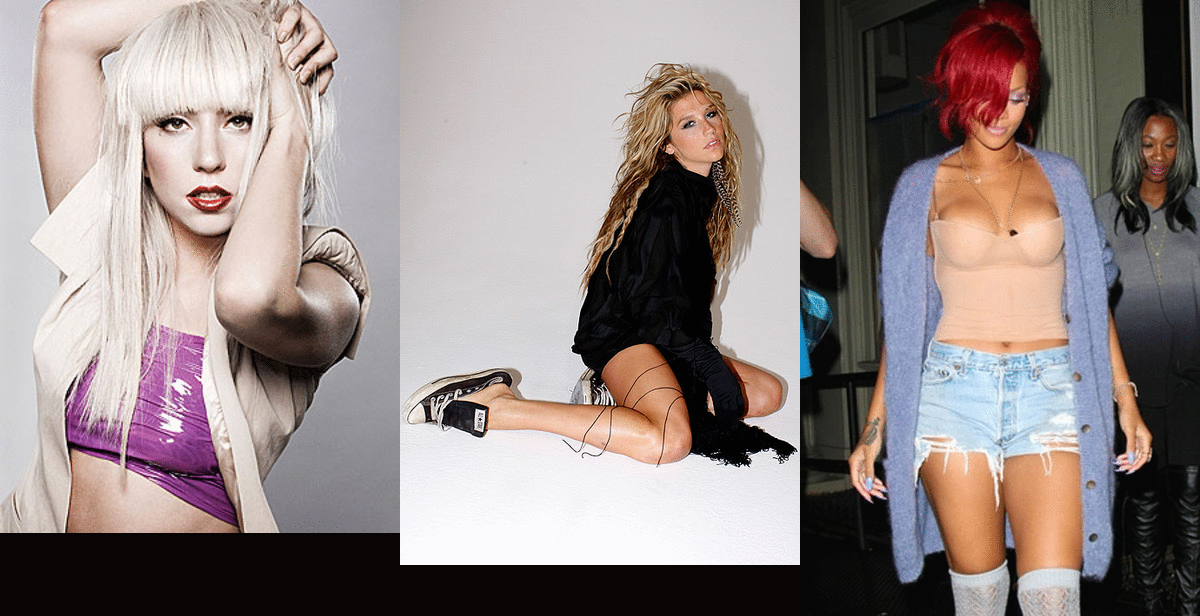
The inside cover of my digipak is quite simplistic and minimalistic, as my artist just breaking out into the music industry and we wanted her to have a mysteriousness and unique aura to her. In the music video, Zena, the artist, isn't your typical female artist. If you look at artists such as Rihanna, Lady Gaga or Ke$ha, Zen is represented a lot differently. In her outfits she is covered up by a relatively long gown, and the focus is more on her face and her make up, which could possibly hint at her intelectual beauty as well as outer. Therefore, although the audience is aware of her good looks, she is seen as more than a 'sex symbol'. I wanted to recreate this in my digipak so I used mostly her face. However, we did still want her to be appealing to the eye and we wanted her to be someone a female could possibly emulate, so costume and make up was very important and it links our video and my ancillary texts together as we portray her as pretty and fashionable.
 |
| Front cover of digipak |
 |
| Front cover of Rihanna's digipak |
 |
| Picture I took of myself for the front cover of my digipak |
 |
| Fold out of Rihanna's 6 page fold out digipak. |
 |
| Still of Zena from our music video. Notice this shot is a MS, which is the same shot in our digipak. This the two together making them recognized combined products. |
 |
| Image cut in half. |
 |
| Image I used for the back of the digipak. |
I used photoshop to make it black and white and a little more contrasted to make the image stronger and fit in with my chosen theme of black white and red (but I added pink to make it more feminine). The inside cover also has 2 black and white pictures and one picture is another still from a video. This also makes the audience recognise the music video and advertisement as linked products, which helps a lot with marketing and promotion.
I used the same shot types such as ECU's and CU's like in my video. Here is a comparison with the original picture for the inside cover of my digipak and a still from my video.


As you can see they both have the same expression and are in CU shots. However, one downside is as I imported the pictures for both images into photoshop and enlarged it, it decreased in quality - it wasnt as crisp as it was when it was the original size. Had I had more time and proper equipment to take a better quality picture I think my digipak could have been stronger.
 |
| Inside cover of digipak |
I wanted a simple image on my CD cover as I did it not want it to distract from another still on the left side on the inside cover but I still wanted to showcase Zena's beauty in a mysterious way. I have again used a still from my music video - which is a clear link and also helps give a 'behind-the-scenes' feel to my video, which helps give a personal feel to the inside cover, as if it is a book and they are opening it to read her story. Again, I wish it were better quality as it turned out a little more blurred than planned. Here is the original photo I used.
I have to admit I found it a little harder to find links between my advertisement but basically I used the same artist and the same image that I used in my digipak which is an obvious link and helps to promote the artists, for instance if they see a picture of the album cover on Itunes (which is on the advert) they will automatically recognize the as linked products, therefore being more inclined to purchase them. I have also stuck with the same theme as red black and white which makes all of my ancillary texts flow together and look presentable. The way Zena is placed on the top in big bold letters is to draw attention to her, which is typical of advertistments to have the artists name so bold in the advertisement. Furthermore I have put the Itunes Logo and the record label on the top to make my advert look professional and worthy of consumers looking at it.
Until then!
Stephanie
.jpg)

No comments:
Post a Comment