Showing posts with label Prince Kongo. Show all posts
Showing posts with label Prince Kongo. Show all posts
Saturday, 28 January 2012

Friday, 27 January 2012
Evaluation Question 4
What Have Your Learnt From Audience Feedback?
On December 6th I went to the cinema to watch my music video. They day is vital as it was the first time we all got to watch our music video, it was also a great way for me to see the audience reactions and get some feedback from them. I made sure I had my camera with me on the day to document this experience and I also caught up with some people who watched my video and they gave me some feedback. I took notes on some of the feedback I got from people and me and my group also filmed some people talking about our work.

Shani has seen both my music video and ancillary work. She stated she liked how all my work is linked together and how it's good as she as an audience knows what they are all about. She stated that my Advertisement gave her all the information she needed and that we kept the video really professionally and it was enjoyable to watch. Lastly she stated that she watches my music video when she has time to spare and she has shared the video with her family and friends.


People also said that the video used conventional editing and effects that is used in our dub-step genre that we followed. Our teacher's also said that we could have adding in some extreme close up's of the dancer's as they danced, If we did do it again I would have cuted in some closer shot's of the dancers as they done their choreography. We was also told that he dancers and singer should have had a scene together it would have made our video more effective then it already was. My ancillary work got a lot of positive feedback to if anything I could have added some more designed at the back of the digipak and I could have done more with the cd holding panel. I was also insured that everything linked and that everyone was impressed. I really took in all these feedback in as I think they are really important as an artist or manager or anybody working in music. They really help you to know what errors not to do next time you create a product or ancillary text and it is always good to hear feedback from your target audience.
On December 6th I went to the cinema to watch my music video. They day is vital as it was the first time we all got to watch our music video, it was also a great way for me to see the audience reactions and get some feedback from them. I made sure I had my camera with me on the day to document this experience and I also caught up with some people who watched my video and they gave me some feedback. I took notes on some of the feedback I got from people and me and my group also filmed some people talking about our work.

Shani's Feedback: The Music Video was beautiful and Lovely I love how it is also linked to the digipak. The best thing I like about the video was all the shot's of the artist lip-syncing loves how there was such a variety and loved her make up, costume and the mis en scene. I loved it so much I showed my mum.
Shani has seen both my music video and ancillary work. She stated she liked how all my work is linked together and how it's good as she as an audience knows what they are all about. She stated that my Advertisement gave her all the information she needed and that we kept the video really professionally and it was enjoyable to watch. Lastly she stated that she watches my music video when she has time to spare and she has shared the video with her family and friends.

Carolines Feedback: "OMG prince your video is so nice, I love the special effect's and the girl's lip-syncing was excellent. It really felt as if the song belonged to the girl. I love how things went backwards really made if more interesting then just normal dancing."
Levett's Feedback; "The actual artist was always present so we knew who was singing the song. I went with the genre, I really liked it Top Job, 10 out of 10, 100% for effort."Here is the video of Levett's feedback. Links at the bottom will lead to two more feedback video's.
- http://www.youtube.com/watch?v=EaQHz8CqMLY&feature=youtu.be
- http://www.youtube.com/watch?v=yCJUXg4HAeY&feature=mfu_in_order&list=UL

People also said that the video used conventional editing and effects that is used in our dub-step genre that we followed. Our teacher's also said that we could have adding in some extreme close up's of the dancer's as they danced, If we did do it again I would have cuted in some closer shot's of the dancers as they done their choreography. We was also told that he dancers and singer should have had a scene together it would have made our video more effective then it already was. My ancillary work got a lot of positive feedback to if anything I could have added some more designed at the back of the digipak and I could have done more with the cd holding panel. I was also insured that everything linked and that everyone was impressed. I really took in all these feedback in as I think they are really important as an artist or manager or anybody working in music. They really help you to know what errors not to do next time you create a product or ancillary text and it is always good to hear feedback from your target audience.
Thursday, 26 January 2012
Wednesday, 25 January 2012
Evaluation Question 2
2. How Effective is the combination of your main product (video) and ancillary texts (digipak and Advertisement)
I belive my ancillary text was sucessful as I followed the conventions of the Genre it is using. The most important thing about it is that i created an Identity for my artist given her a signature look and focusing on the angles that her audience have seen before. I think her target audience would be attracted to it as i used big dark purple font's that stand out and used an image that can be referenced back to the music video. My target audience would be between the age of 16 up to 25 and I think that my digipak and products appeal to them as I used new aged editing effects in my video and my ancillary text stand out and grabs their anttention and sells m artist.
I belive my ancillary text was sucessful as I followed the conventions of the Genre it is using. The most important thing about it is that i created an Identity for my artist given her a signature look and focusing on the angles that her audience have seen before. I think her target audience would be attracted to it as i used big dark purple font's that stand out and used an image that can be referenced back to the music video. My target audience would be between the age of 16 up to 25 and I think that my digipak and products appeal to them as I used new aged editing effects in my video and my ancillary text stand out and grabs their anttention and sells m artist.
Monday, 16 January 2012
Evaluation Question 1
1.In what ways does my media product use, develop or challenge forms and conventions of real media products?
When making our music video I wanted to use real media conventions on doing that we took inspirations from diffrent music videos. I have taken inpiration from artist like Nero, Pixie Lott, Rihanna and Chase and Status who I have blogged about in my past post. As I took inspiration from real media products I am going to explain how I used, developed and challenged the forms of convention. When researching on the media conventions on exsisting videos I made sure to concentrate on the mis en scene, camera work and editing.
The first video I used for influence was the orginal video Nero's Guilt, as it has the conventions of what a dub-step video should compose of. One of theorist Andrew Goodwin's points on conventional music video's is that music video's are either Illustration,Amplification, or a Disjuncture. From Looking at our music video you can see that it has little to no connection to the lyrics nor does it contradict the lyrics.What I liked most about the visuals of the video was the the camera work used especially the diffrent angles of the female vocals face.
When making our music video I wanted to use real media conventions on doing that we took inspirations from diffrent music videos. I have taken inpiration from artist like Nero, Pixie Lott, Rihanna and Chase and Status who I have blogged about in my past post. As I took inspiration from real media products I am going to explain how I used, developed and challenged the forms of convention. When researching on the media conventions on exsisting videos I made sure to concentrate on the mis en scene, camera work and editing.
The first video I used for influence was the orginal video Nero's Guilt, as it has the conventions of what a dub-step video should compose of. One of theorist Andrew Goodwin's points on conventional music video's is that music video's are either Illustration,Amplification, or a Disjuncture. From Looking at our music video you can see that it has little to no connection to the lyrics nor does it contradict the lyrics.What I liked most about the visuals of the video was the the camera work used especially the diffrent angles of the female vocals face.
 |
These angles really signified the singer's presense and was a great way to introduce her to the audience as an artist. I adapted this into our music video by have three base tracks of close up shot's of Stephanie lip-syncing. From looking at the slideshow above just like in the guilt video we had shot's of her from different angles. Another convention we used was the use of Video Layering, a inspiration we got fro Pixie Lott's "All About Tonight" video. In the pixie lott video her face is emergaged and layerd ontop of an establishing shot of a city landscape, I used this technique in our video in the begging where I layerd the face of our artist with our locations. This can be through out our video and is fetured in many exsisting music video today. It was important to have Stephanie looking into the camera as this is one of Andrew Goodwin's theory of conventional music video's. Goodwin believed that pop video's use the singer as narrator's and characters and they look directly at the camera to try and get the viewers at home involved.
While watching the video for guilt I was impressed even more by the location selected for the clip. The guilt video started with a shot of the camera panning above a city scape with night lightes glitering. I infused this into my video near the end where I had shot's of picadilly circus at night, I then edited this shot and added a slow motion effect to stylise the shot and make it more effect then It already was .
 |
| A shot of my Video along side shot's from Guilt And All About Tonight |
We was also impressed by the editing and how the video featured some of the points of Carol Vernallis. Carol studied editing and camera work closely in music video's here are some of the point's from her observation.
- The usual riles of 'continuity' editing are broken in order to draw attention to what is on the screen.
- Edits may be really obvious to draw attention to themselves. Wipes and special effects are added.
- Jump cuts are often added.
- A master shot or base track is frequently used to give the video a structure.
- The camera may move in time with the music.
I made sure to pay much attention to some of her point's, you can really see how we adapted her point's into our music video as we used lot's of jump cuts from locations in the video into shot's of Stephanie's face. We used fades and slowed things down she also made clips rewind and move backwards which really drew our audiences attention and I tried to make the camera move to the beat and also have a structure in our video by using base tracks of Stephanie lip-syncing to the song.
(Our Music Video)
Creating our digipak is very important as this will be one of the things that helps sale our artist to it's target audience. I done this by looking at past and present digipak's and analysing there features and structure, I also learnt about the things that I should not include or do with my digipak e.g Written on the artist face, making the artist name to small to see. I made sure I followed the convention of using Three Colours based on my font image and background also Maximum Of Two Font's. It was also important for me to have a clear link between all my ancillary products so that the audience I'm trying to target will know that they are all apart of one promotional package.
 |
| The Outside Of My Digipak |
 |
| This is a collage of My Digipak Cover and Three other Conventional Cover's That I took Inspiration from. |
Following the convention codes of Albums such as Beyonce's I Am,,Sasha Firce, Rihanna's LOUD and Nero's Welcome To Reality I think I was able to create a vert effect digipak as I think It ticked all the boxes and I was consist throughout my work. I took inspiration from Nero as I liked the way he used the font in his promotional packages as they are very striking and are recognisable as them without having to second guess who it is. I did challenge some of the convention in my genre. When doing our research we took notice that most dubstep artist and groups did not use their faces in their digipaks or advertisements. At first I was also going to take that approach then I decided not too as I thought it was odd and I would want my artist to be recognisable and also to sell her as an artist people would have to see who she is and what she looks like. I done that buy rearching on Pop singer's such as Beyonce, Rihanna and Pixie Lott as they followed the conventions of female artist in the industry what I took from the was that most of their ablums cover's where close ups of their faces. So I made sure that my Digipak cover was of my artist face. All of my panels had a recurring colour scheme of purple, I choose purple as it stood out and was eye catching but without taking attention away from the images and information given.


Monday, 12 December 2011
Monday, 5 December 2011
Sunday, 4 December 2011
Talk That Talk
As we have been studying digipaks and their roles in the music industry. I thought it would be interesting to take a look at a digipak that just came out into music stores today. The reason I found this particular digipak effective it was because the amount of extra things it came in with
Photoshop Practice
In my last media lesson out teacher told us before we began making our digipaks we had use Photoshop first. I am one of the lucky few who has worked with photoshop before as I take photography as my other lesson. We had a little task on using two images of out teacher Dan and using them to create a digipak with him being the artist. It was really fun just so that we can play around with the images and just get used to using Photoshop. And it was the first time I even made a digipak. My digipak of dan was not good as I had hard times trying to decide what image I should use for the front and back and I was also to busy helping other people using the Photoshop programme. I think I have one screen shot of my process with my practise digipak that I will post under.
Do's And Don't
* Clear font
* Correct size for image & font(NO stretching of images! So not professional nor is it attractive)
* Clear in-focus photos
* Appropriately shaped photos(these need to actually fit the page)
* Layout that follows the rule of 3rd's for composition
* Appropriate type face that follows a house style & genre conventions
* Aware of the fonts placing on package(it must follow the genre of convention & be clear from a distance)
* Follow the conventions of the 3 color rule & use color that is appropriate for images, font & background
* Careful thinking about how font, image & background integrate (remember, the way text is placed next to an image will perceive an specific meaning)
* Proper positioning of barcodes, date, copywright, titles & artist name
Don'ts
* No stretching of images
* Use layer styles
* Use unnecessary effects. Any effects used must suit thee genre
* Place text across the artists face
* Use a font because you like it
* Use a different font on every panel - not really needed, be creative
Album cover design
* Stick to 3 colors
* Range - personality
* Intro to artist - first connection
* Working with images( Distorting images e.g appealing shorter, wider or taller than actually is)
* Artist name bigger than album title
* 6 sided(3 side by side), 4 sided(2 side by side)
Analysis Of Advertistment's
Conventions Of Music Advertisement's
Band/Artist Name: This is the key element that all music advertisements include, because the audience need to identify the artist who is promoting the CD/Album.
Image: Another key convention is an image that relates to the band/Artist. Also you can often see an image of the artist on the advertisement in order for the artist to self-Promote
Image: Another key convention is an image that relates to the band/Artist. Also you can often see an image of the artist on the advertisement in order for the artist to self-Promote
Colour Scheme: The colour of the advertisement reflects the mood and the genre of the song, as well the own artists image. For instance , for a rock band you associate them with dark colours.
Logo- Mainly bands use logos on their album , they do this in order to be recognised by their target audience. Also the record label logo may be used in order for their label to be widely known for producing quality music.
Headline: On the magazine advert for the album, it will usually feature the band name and album title etc, but will also have a main headline selling the product and grabbing the attention of the target audience. Usually, this is big and stands out and is usually put across the main image so the two connect and stand out.
 |
| Rihanna Loud Poster Advertisement |
Loud Tv Advertisement
CHASE AND STATUS
 |
| Chase And Status Advertisement |
This is the advertisement for dub step group chase and status. Unlike Rihanna this advertisement does not feature the artist faces. I have also discovered that most dubstep and producer based artist do not use their own images on their digipaks as I think they wont the main focus to be on the material inside. It does however follow some conventions as it includes the artist name and album name to promote the cd and album, the colour scheme is black and white with some yellow writing, simple but the yellow really stands out on it's own especially with the big bold font's used for the bands name and album title. Another key convention is that they used the same image that was featured on the album cover, The dog has also become some what of a logo and is recognised by chase and statuses target audience. Their is also other information on tour dates, sites and ticket information. This digipak will appeal to those who like dubstep and electronic music as the picture and graphics appeals to that genre and people aged between 16 - 30 preferably boys. The use of the black and white shows that it is really edgy and kinda dark but the yellow indicates that it is upbeat.
Tv Advertisement
Analysis Of Three Digipaks
In order to create my very own digipak I am going to have to research on already existing ones to help give me ideas. I have tried to look at mainly dub step digipaks as that is the genre that my artist is in and here are some of the digipaks I found.

 This is the digipack of dubstep duo Nero named Welcome To Reality. The first thing you see on the front cover is the name of the artist in a big bold font. When researching for these dubstep digipaks I released that they all have the artist name big and bold on the front cover they make sure they sell their name and capitalise on that. There is an animated background on the front cover that includes a city landscape at night with stars in the skky and you can see two people just under the big bold nero font's. They used two fonts through out and all the colour where dark , contrasted and complimented each other The front cover is very edgy and creative like most dubstep cover's they always try to make them as astonishing as possible using different methods to make their cover's stand out form the rest. With Nero they done that buy using their interesting Nero logo which is really distinctive to their fans and also the animated theme in the from the front cover.
As our artist is female I really wanted find some female figures in dustep to analyse their digipak. I found this digipack of dubstep singer Katy B for her album On A Mission. The album cover consist of a wide shot of katy standing in the middle of the streets with the font's KATY B printed across the cover. The picture has been saturated with blue and green colours to add an effect. Not edited as much as nero's but it still has it's own theme that it's tryna give acrross. Again the font is big like most dubstep cover's even though the font on this digipak is not as bold as other's it's still big enought to grab attention and to sell the artist's name and brand..

The back follows the same structure as most dubstep digipaks, it's simple and has the same font as the cover, has the same colour theme as the front and has the albums name enlarged. Everything is kept simple and consistent, after looking at artist who are in the dub step genre I also looked at pop artist such as Rihanna, Pixie Lott and Beyonce. I looked at these artist because the pop genre is crucially run by image and they do a great deal of marketing campaigns to sell their female artist.
What I have realised about when it comes to female digipak is that they relied more on their image rather then graphical content's. Most of the female I researched on they looked straight into the camera given you that gaze showing there innocence, power and also an attraction for males as it seems as if they are calling them. Most of these digipaks have main focuses that consist on the artist posing, looking into the camera wearing outfits that showcases their body part's.
Wednesday, 30 November 2011
Analysis On Past Student Digipaks

What i like about it is that it caught my attention as soon as my eyes laid on it . I really like the colour combination used as it's really bright and gives me an appreciation of what genre and what type of music the artist is. The colours and font run through all of the digipak and is consistent, there are images of the artist herself so the audience can identify her. I love the theme they used as it's fun, up beat and pop like the music being sold. I love how the student was really creative with his pack and used his imagination and pulled all the stops to make it as effective as possible. The only negative thing I could think of is that the track list might be hard to read for some people as it's red and the colour is colliding with the blue sky behind it, either from that I thought it was a great digi ack one of my favourites.

This digipack was not as great as the other ones that I have seen. I feel like the colour scheme was off the front cover had colour while the rest where just full of purple, I feel it could of been consistent. There is not enough information on the digiipack, There i nothing on the spine of the case, there is no production, copyright and publishing info. I also think the album cover of the artist is not warming or flattering, the artist looks sad which can be off putting for a consumer.
Importance + Function Of Digipaks In The Music Industry
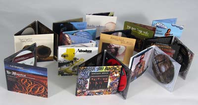
In my lesson on Monday we had a class discussion on the functions and importance of digipaks. As I have now finished filming my music video it is now time for me to let the audience know about the new artist music so it can attract fans and a bigger audience.
What's A Digipak?
- A Digipak is a modern approach to cd packaging
- Gives out more information about the artist/band
What's Inside A Digipak?
- Images of artist, Graphic designs, Font designs
- Repeat of track list some may include more information for example length of the song
- Acknowledgement

- Image of artist and artist name (clear font, easy to read)
- Track listing (same font as artist name or album name)
- Production information
- Record Label
- Web address
- Promotional sticker
- Bar Code
Advert
- Tour Dates
- Artist and Album Names
- Release date & Record label logo
- Review Quotes from magazines
- Artist Website
- Visual Style Colour Scheme
Ancillary Products
- Tv Adverts
- Music Magazines
- Gigs
- Social Network e.g Facebook, Twitter, Myspace
- Billboards
- Newspapers
How Are Digipaks Useful To The Music Industry?
- Helps promote the artist
- Build a fan base
- To make money
- Boost sales of CD's in the music industry
- Visual representation (Image of artist is important to the audience)
- Useful for establishing the artist genre
The main features of a digipak are the artist name and name of new album. It should also include the album track list on the back and production information (e.g copyright disclaimer). Ancillary products are important for the artist and the music industry because without them the public would not hear about the new music. In our last media lesson our teacher asked us who paid for music last year and only 4/15 put their hands up. This shoes that not a lot of young people buy music and if they do they download it illegally. With that being said that are still some people who buy and use CD's, these people like to collect CD's, old fashioned people tend to still buy music and some buy music to keep the music industry going. By record company's putting money into producing these advertisement product's they are able to target a wide range of people, and it also helps to persuade more fans to spend money on these product's.
Cinema!!

Just to a reminder that I will be going to the cinema on the 6th of December to watch the premier of my music video. I am really excited as this will be the first time my friends and teacher will see the final draft of my music video. I can't wait to see everyone's reactions and hear there thought's
I will bringing my camera on the day to take pictures and maybe some video's. I will also do quick interviews with some of the a2 media student's to get some feedback..
Subscribe to:
Posts (Atom)